background
CATA is a well-established non-profit arts organization in the Berkshires, celebrating their 30th year.
We partnered with them for four years, to develop their overall branding, and to enhance the look and feel of their printed and digital materials, helping them to stand out, align more closely with their values, and speak more directly to their target audience; growing their donors, artists, and fundraising capabilities.
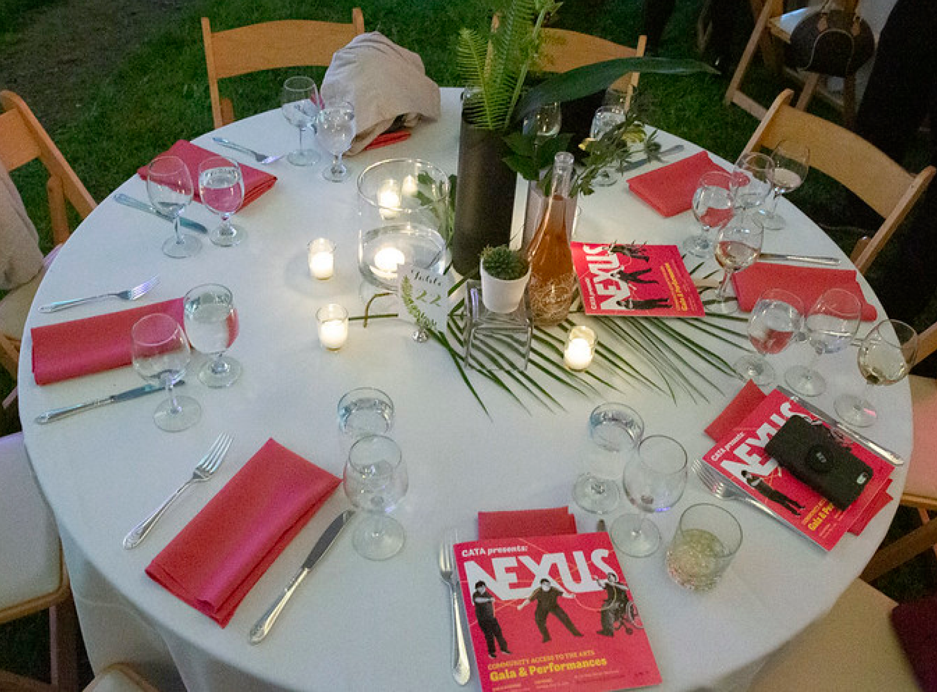
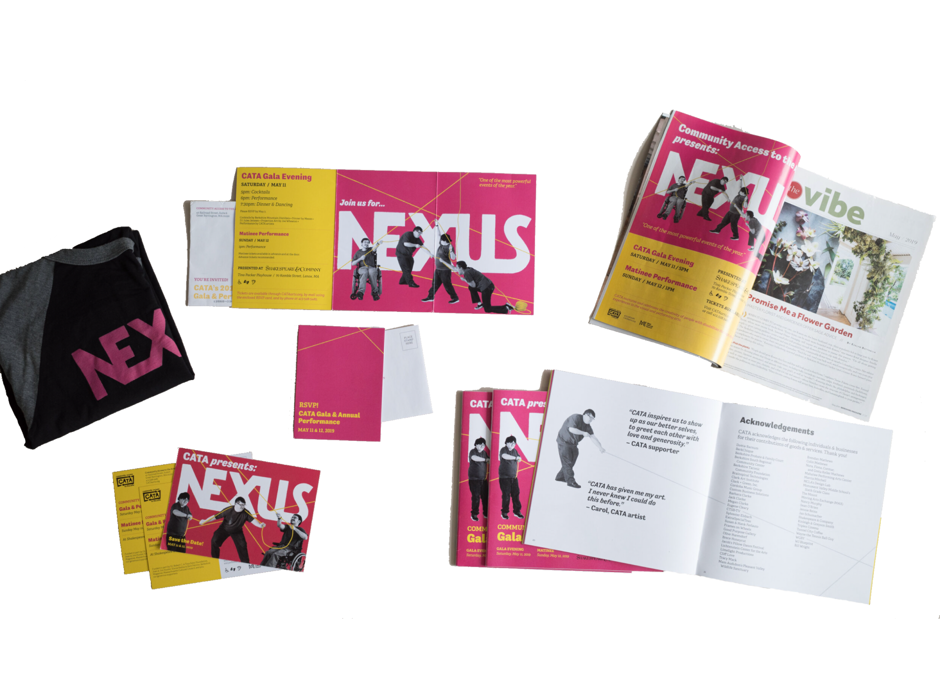
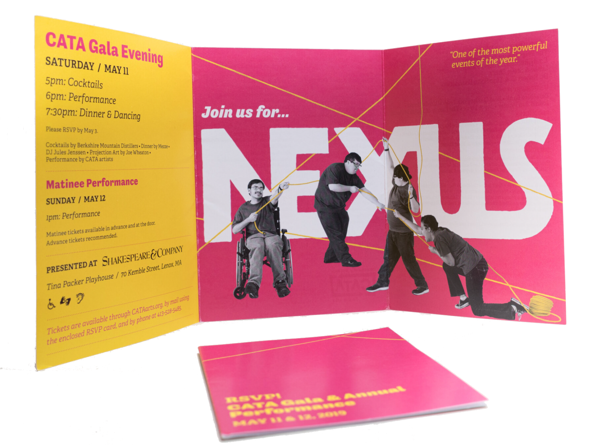
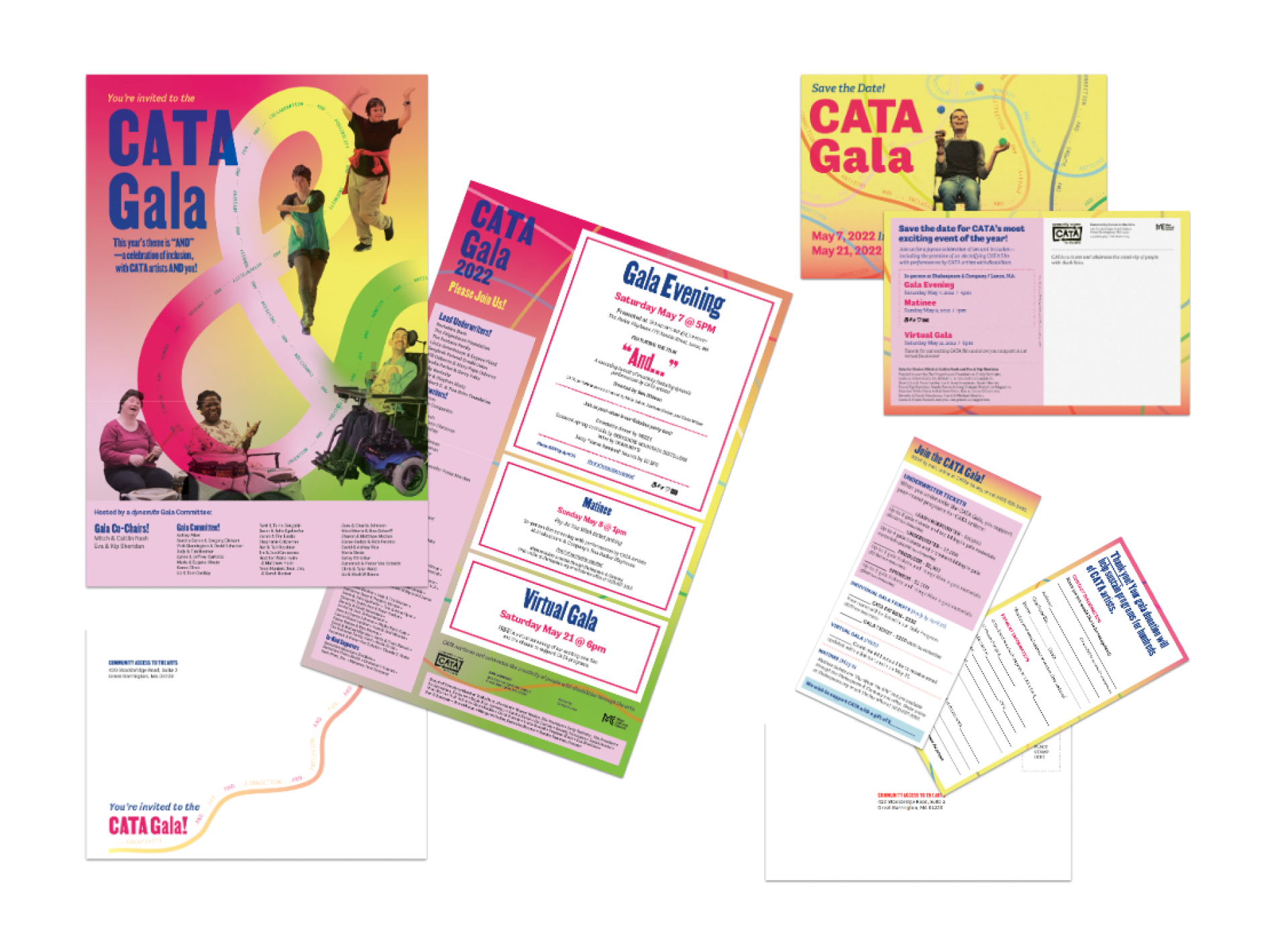
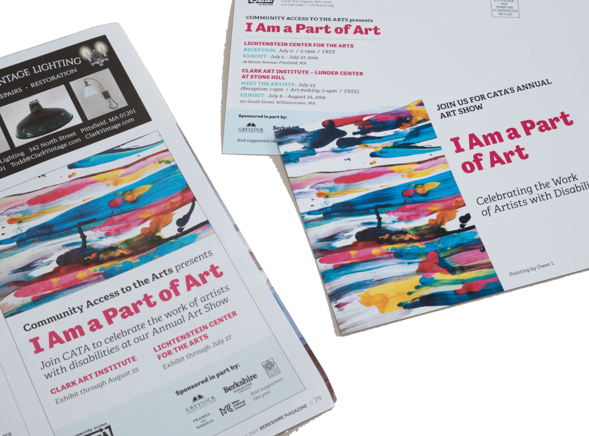
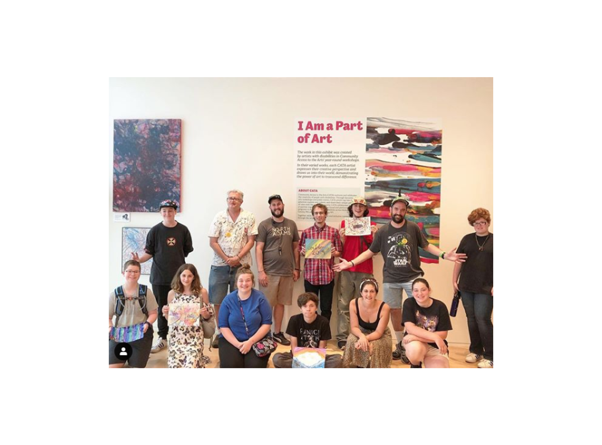
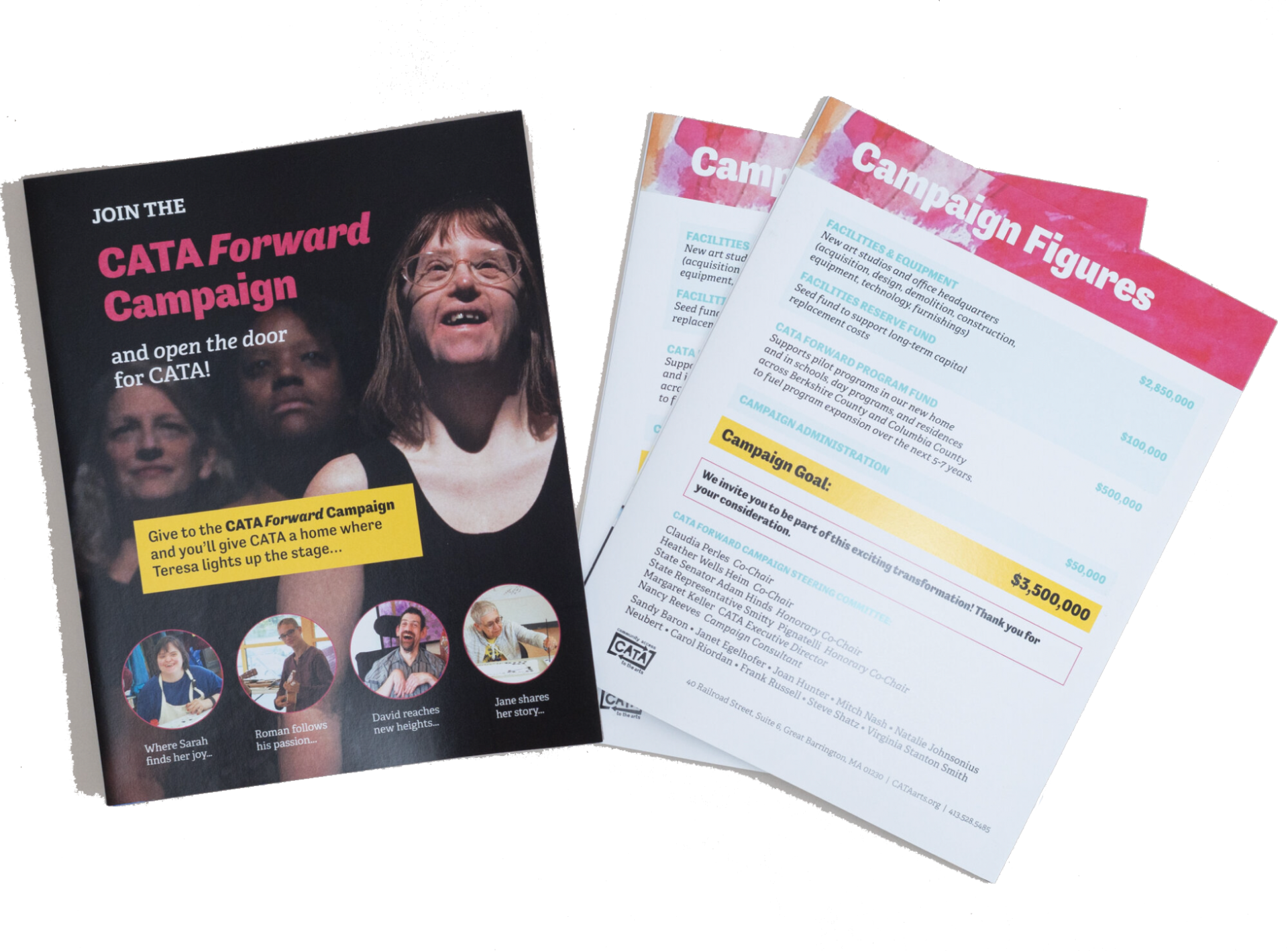
We designed all of the marketing, fundraising, and exhibition materials for their annual events. We designed each year’s materials around different themes, along with names and sub-brands. Their events include a gala and fundraiser, group art show at The Clark, and poetry readings.
our approach
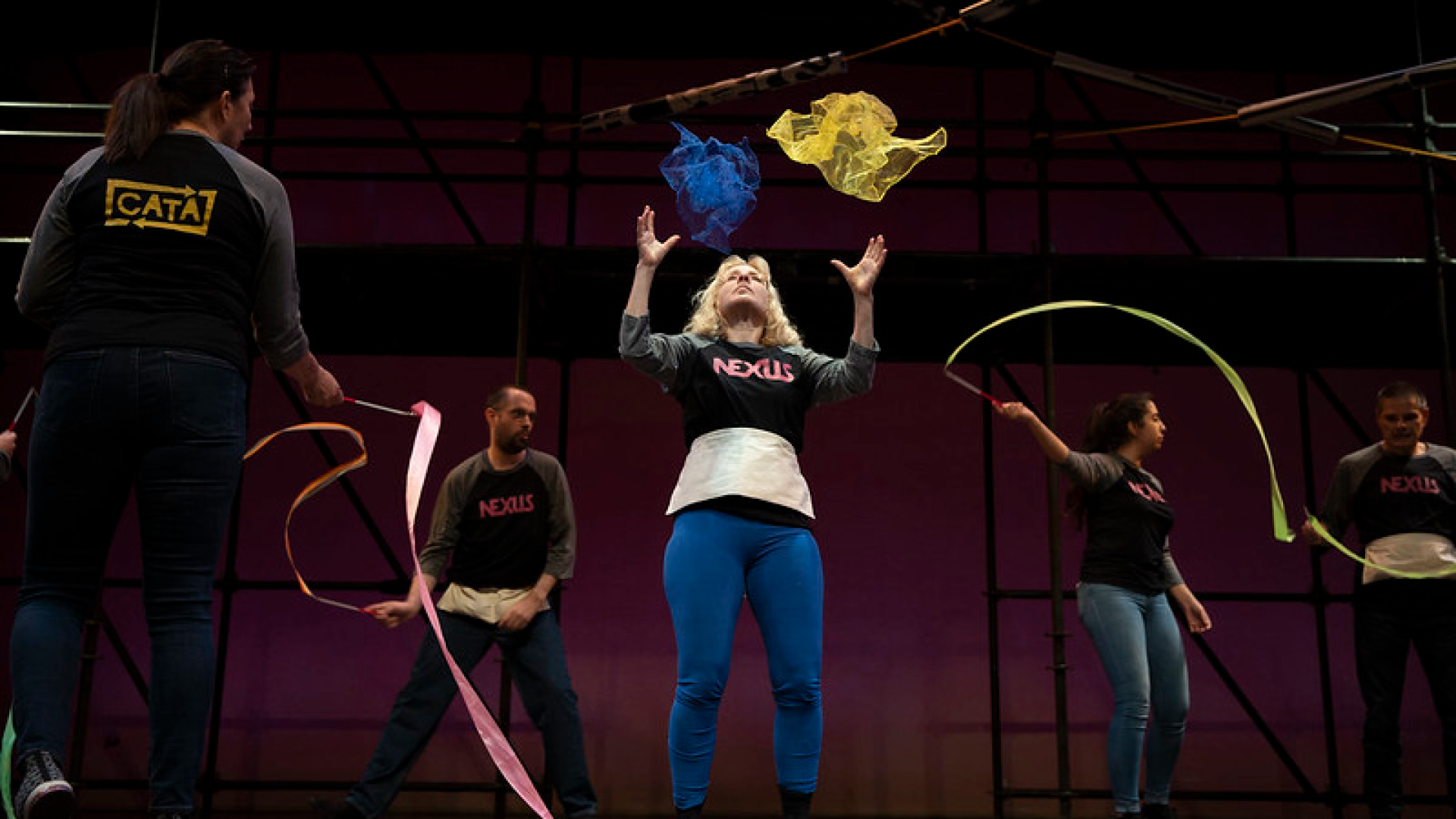
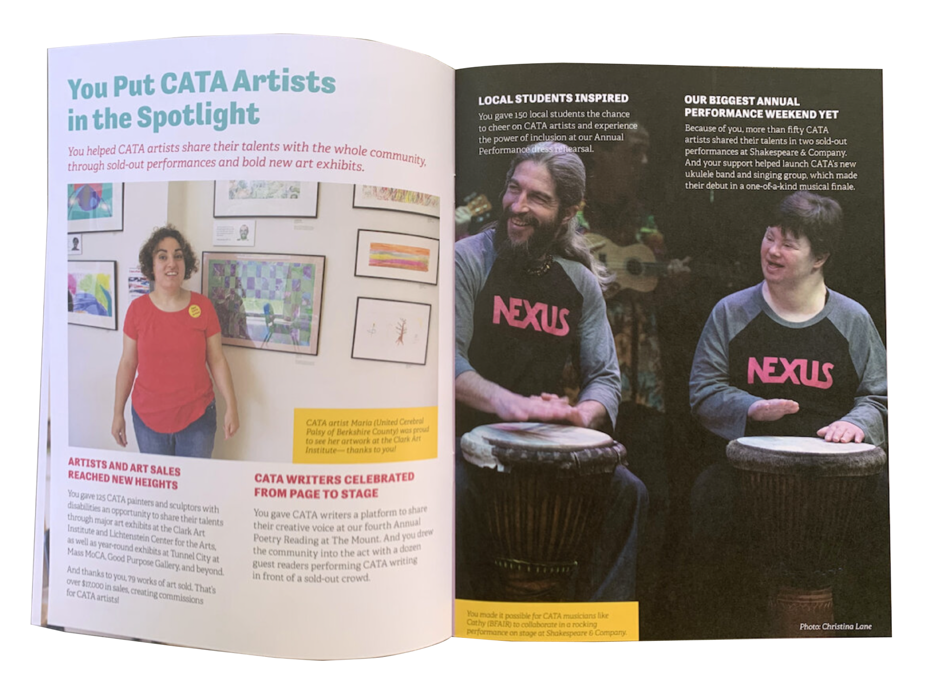
Our strategy helped to highlight the profiles and artwork of CATA’s students, and to nurture and celebrate their community of artists with disabilities through a shared experience in the visual and performing arts, and honor CATA’s goal of continuing to grow a creative, inclusive, and joyful community.
We also sought to do the variety and complexity of the organization’s work justice, through sophisticated and elevated, surprising and bold, dynamic and tactile design.
Our work put the people and the art forward, and added a conceptual and elevated touch, all the while providing the audience with the necessary information and with effective calls to action.
SCOPE
Art Direction
Brand Strategy
Visual Identity
Event Branding
Print & Digital Marketing
Merch & Exhibition Design
Fundraising Materials
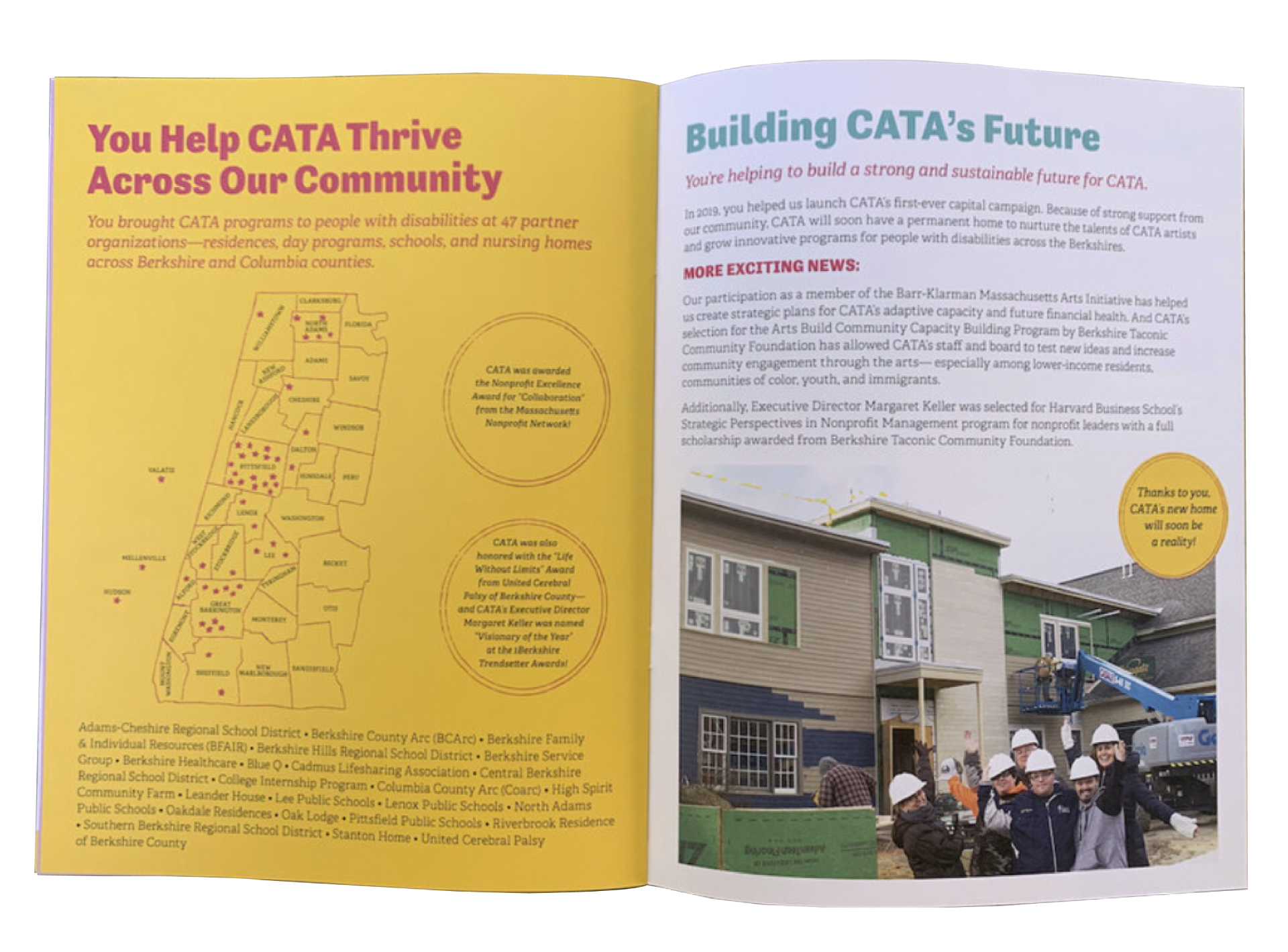
Capital Campaign
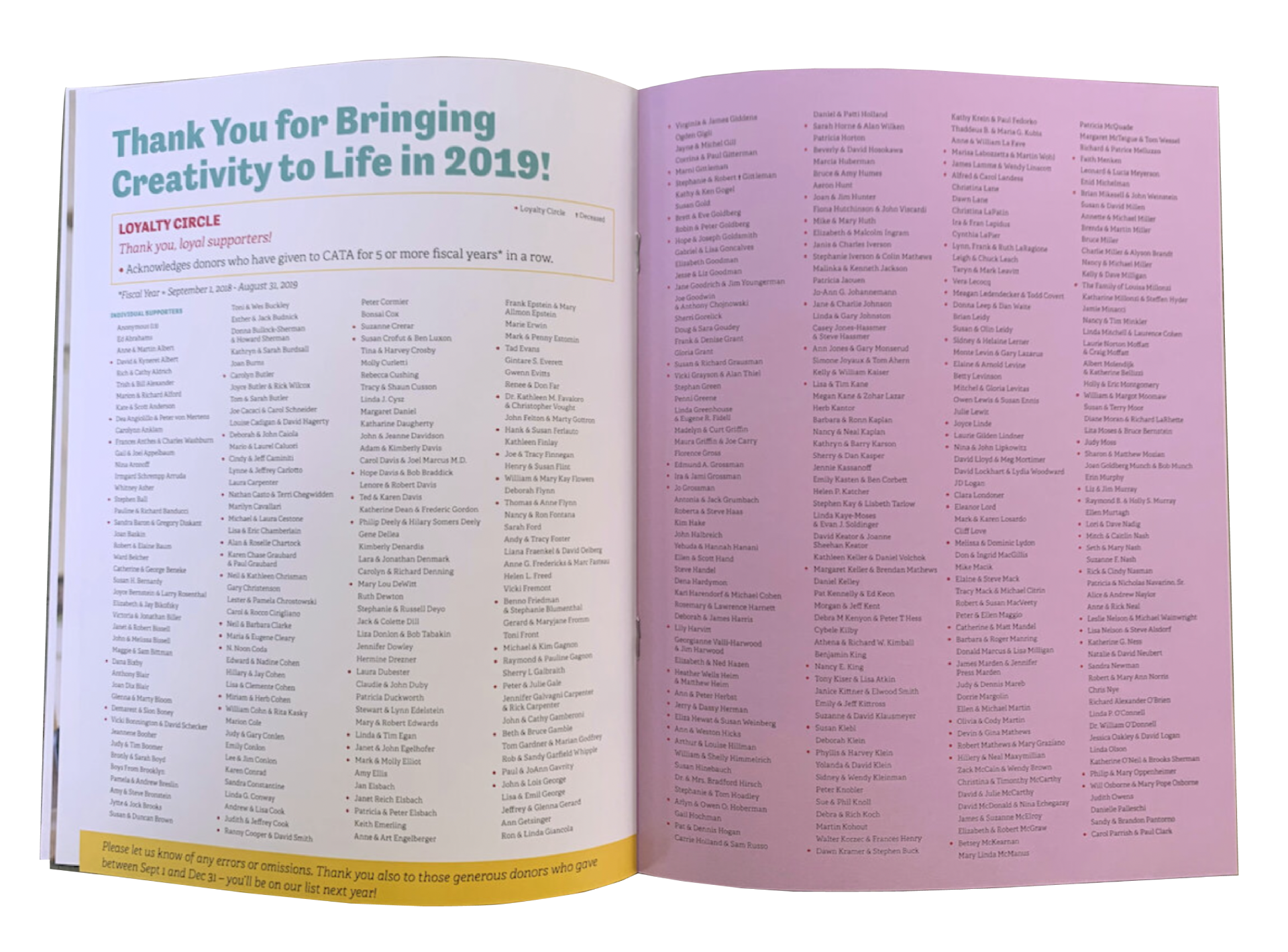
Impact Reports
Print & Digital Ads
Hand-lettering + Illustration

